Styling Britecharts
In the Getting Started Guide and the Composing Your First Data Visualization tutorial we saw how to create and configure Britecharts. We have created beatiful charts, however, users have specific branding and styling needs that want to get in their charts to adapt to their user interfaces.
In this tutorial, we will go over the different options we have to customize Britecharts. You will learn how you can use Britechart's color schemas to change the charts colors or customize your own. We will also see how to override the CSS styles that come with Britecharts and how to update the fonts.
Applying a color palette
Let's look at some customization options we have available for Britecharts. The first one is the color schemas and gradients. You can find some of them in our Color Palettes demo page.
To get us started with a tutorial, we are going to take our Getting Started tutorial code and create a new HTML file based on it.
We will start from the code we got at the end of that tutorial, removing the responsive part:
// Instantiate Bar Chart
const barChart = britecharts.bar();
const container = d3.select('.bar-container');
// Create Dataset with proper shape
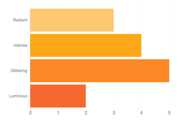
const barData = [
{ name: 'Luminous', value: 2 },
{ name: 'Glittering', value: 5 },
{ name: 'Intense', value: 4 },
{ name: 'Radiant', value: 3 }
];
// Configure chart
barChart
.margin({ left: 100 })
.isHorizontal(true)
.height(400)
.width(600);
container.datum(barData).call(barChart);
Starting with this bar chart, we want to customize the color palette. For that, we first need to load our color schemas by using this script tag:
<script src="https://cdn.jsdelivr.net/npm/@britecharts/core@**2.10.0/dist/umd/colors.min.js"></script>
Then, we can set the color schema of the bar chart by doing:
// Configure chart
barChart
    .colorSchema(britecharts.colors.colorSchemas.orange)
    .margin({ left: 100 })
    .isHorizontal(true)
    .height(400)
    .width(600);
That renders an orange bar chart:
The different color palettes we provide in Britecharts are ubicated within the colorSchemas object. You can see their colors them in the demo page.
When we look at the palettes code, they are just an array of nine hexadecimal values. For example:
// Britecharts palette
["#6aedc7", "#39c2c9", "#ffce00", "#ffa71a", "#f866b9", "#998ce3"]
Which means that if you want to customize your charts color palette, you only need to pass an array of hexadecimal colors into the .colorSchema accessors.
Using a color gradient
Some Britecharts use a color gradient for their lines (line, sparkline and stacked area charts) or for the body of the chart (brush).
You can find these color gradients in britecharts.colors.colorGradients and similarly, they are an array of colors. However, in this case they are only two colors, one for the beginning and another for the end of the gradient.
Overriding default styles
Whenever we want to change the font family, font sizes or any other styling detail of our charts, we can do so by creating CSS overrides. As an example, let's change the font of our bar chart.
We'll begin by looking for a new font in Google Fonts. I am a fan of the font Oswald, so let's add it to our tutorial by including this link tag in the header:
<link href="https://fonts.googleapis.com/css?family=Oswald:600" rel="stylesheet">
Now, we need to set up a style override. For that, we can inspect our SVG elements with the dev tools of our browser. In this case, we see that the font-family attribute is set by the .britechart class. To override it, we need to add a style tag after the link that loads the default britecharts styling and inside the tag, include following code:
<style>
    .britechart,
    .tick text {
        font-family: 'Oswald', sans-serif;
    }
</style>
This CSS code will override the font-family definition for both the whole chart and the specific tick text of our axes. If we also change the color schema to the red palette, we get this chart:

We could follow the same steps to style most of Britechart's styling. One caveat is that, given that Britecharts is an SVG based library, the styling of SVG elements is sometimes different. In those cases, check out this SVG styling guide to make sure you are updating the right properties.
Summary
In this tutorial, you saw how you can use Britecharts' color helper to apply color palettes and color gradients to your charts. You also saw you can customize all the elments by using CSS style overrides. You can see the tutorial code working here.
To learn more, you can follow our Composing Your First Data Visualization tutorial. You can also check out our Documentation Homepage and our kitchen sink to see all the available charts.