Composing Your First Data Visualization
In the Getting Started Guide, we saw how to set up a responsive Bar chart using Britecharts. This tutorial was easy to follow; however, most of the times our real-world requirements include other components to help communicate our data.
In this tutorial, we will create a complex data visualization. You will learn how to draw a line chart with a tooltip, how to add a legend and a data filtering tool using a brush chart.
Rendering a line chart
Let's build on top of the Bar Chart tutorial by using its code structure. This time, we download the full library bundle instead of just one chart:
<script src="https://cdn.jsdelivr.net/npm/britecharts@2.10.0/dist/bundled/britecharts.min.js"></script>
Then, we will instantiate a line chart:
const lineChart = britecharts.line();
The shape of our data changed as well. We need to check the line chart data schema for this chart. In our case, it looks like this:
const lineData = {
    "data": [
        {
            "value": 0,
            "topic": -1,
            "topicName": "Vivid",
            "date": "2016-08-01T00:00:00-07:00"
        },
        {
            "value": 3,
            "topic": 2,
            "topicName": "Radiant",
            "date": "2016-08-01T00:00:00-07:00"
        },
        ...
    ]
};
Before configuring the chart, we figure out the container's size to apply it as the chart width:
const containerWidth = container.node().getBoundingClientRect().width;
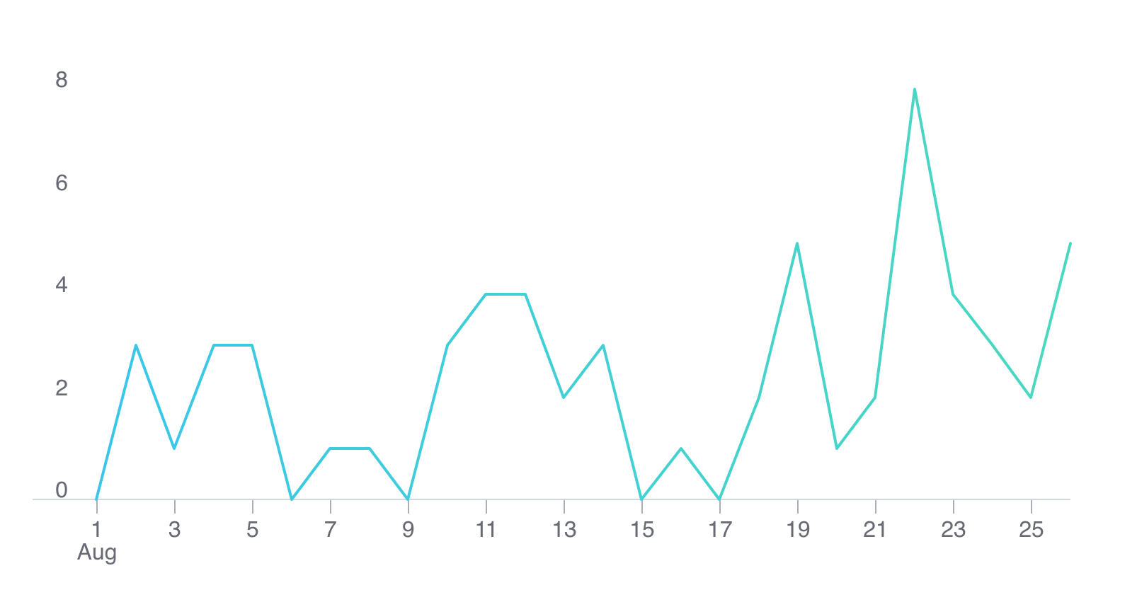
Configuring and rendering the line chart follows an identical approach as with the bar chart:
lineChart
    .margin({bottom: 50})
    .height(400)
    .width(containerWidth);

container.datum(lineData).call(lineChart);
That renders the following chart:
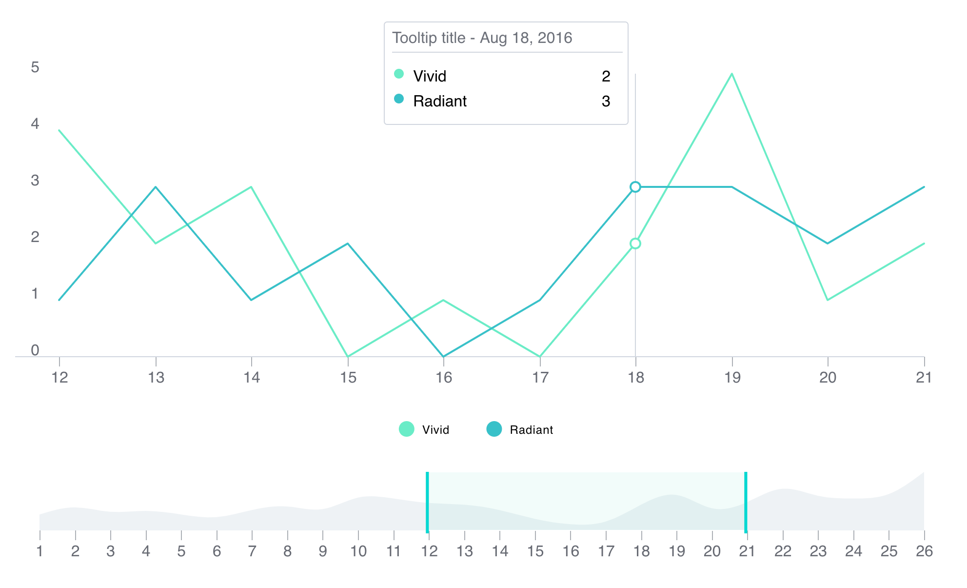
Adding a Tooltip
Now that we have a line chart working, we are going to add a tooltip to allow users to check the specific values on each date. We start by instantiating a new Tooltip component:
const chartTooltip = tooltip();
In the next step, we are going to bind the events triggering when users hover, move or exit the line chart to the tooltip. The methods from the tooltip we are going to use are show, update and hide. Let's see how:
lineChart
    .margin({bottom: 50})
    .height(400)
    .width(containerWidth)
    .on('customMouseOver', chartTooltip.show)
    .on('customMouseMove', chartTooltip.update)
    .on('customMouseOut', chartTooltip.hide);
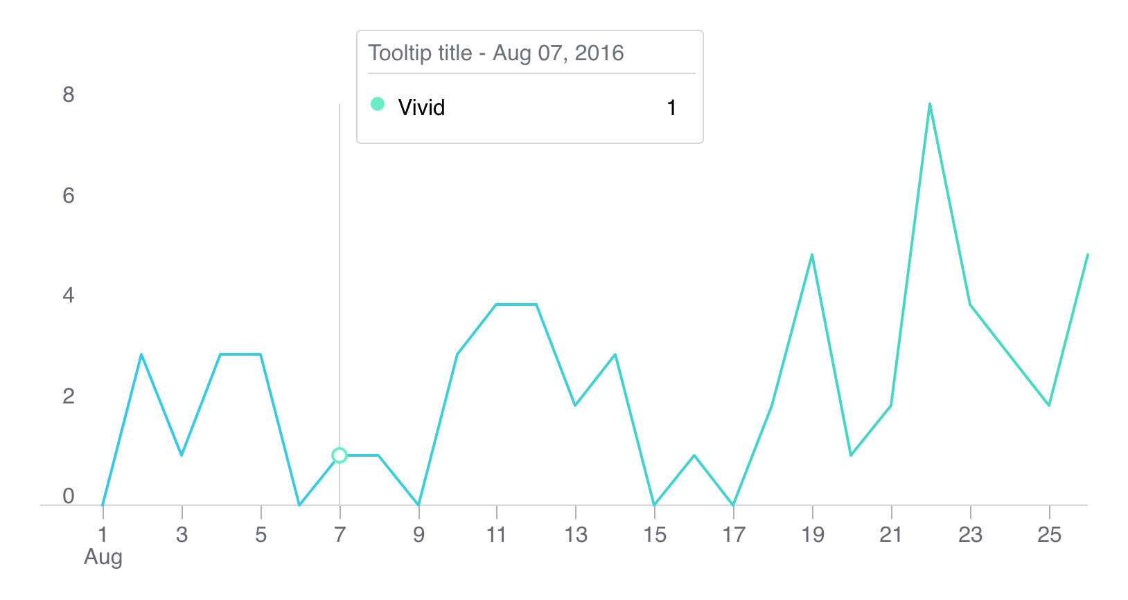
Following the previous code, we expect the tooltip to appear whenever the user passes his mouse over the chart. It should hide when the mouse goes out of the area of the chart. Finally, the tooltip should update its values whenever the mouse moves within the limits of the chart.
We still have to attach the tooltip to the rendered line chart. For that, and only after we render the line chart, we draw the tooltip inside the metadata-group within the line. Let's see it in code:
const tooltipContainer = d3.select('.line-container .metadata-group .hover-marker');

tooltipContainer.call(chartTooltip);
After the previous code, we will see a tooltip like the following:
Drawing a Legend
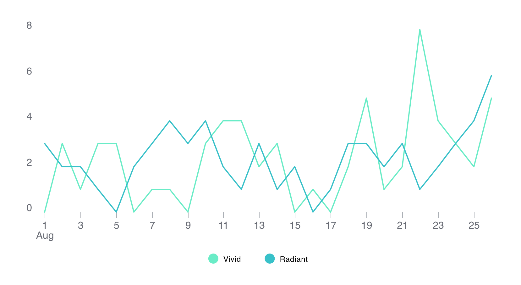
Up to now, we have been working with a dataset that contains only one topic. But what happens if we have two topics? In this section, we will update our data to contain another set of entries. We add a legend component to show our users which line corresponds to which topic.
First, we make a copy of the topic we already have and change some values. We named the new topic "Radiant," and due to our default color schema, it shows as a dark green line.
Now we instantiate our new legend component:
const chartLegend = britecharts.legend();
The same way as we needed a container for the chart, we require another for the legend. To do it, we first create a div:
<div class="legend-container"></div>
And then select the container with a D3.js selection and save the reference:
const legendContainer = d3.select('.legend-container');
The legend is a component that depends on the data and in a specific data shape. We check the Legend data schema, and it needs to be:
[
    {
        id: 1,
        quantity: 2,
        name: 'glittering'
    },
    {
        id: 2,
        quantity: 3,
        name: 'luminous'
    }
]
As we want to show an inline legend, which doesn't show the quantity, we only need to pass an array with our topic names, an id, and a random quantity. Here is how we create that data:
const topicInfo = lineData.data.map(
    ({ topicName, topic }) => ({
        id: topic,
        name: topicName,
        quantity: 0
    })
);
const legendData = [... new Set(topicInfo)];
And we are ready to configure and draw the legend:
chartLegend
    .width(containerWidth)
    .height(60)
    .isHorizontal(true);

legendContainer.datum(legendData).call(chartLegend);
Note how we have used the container width to position the legend in the center. You can see the rest of the options of the legend component in its API reference page.
The resulting chart is:
Filtering Data with a Brush
Our current data is not that extensive, but in theory, our line chart could render datasets of any size. This could be a problem as we could get into a position where the data points get too close, and our users can't see the details of the data. One way of fixing this is by allowing to filter data, and the way we do it visually is by using a brush chart.
In this section, we go over the process of adding a brush chart to our visualization, allowing to drag and drop a section of the data to zoom in that period.
Creating the brush chart
Let's first instantiate the brush chart and its container:
const chartBrush = britecharts.brush();
const brushContainer = d3.select('.brush-container');
We would need to add the container to the DOM:
<div class="brush-container"></div>
Now, as we did before, we are going to check the Brush Chart API and its data schema. The data needs to look like this:
[
    {
        value: 1,
        date: "2011-01-06T00:00:00Z"
    },
    {
        value: 2,
        date: "2011-01-07T00:00:00Z"
    }
]
So, in order to get this data shape, we will need to do some modifications to our line chart data:
const brushData = lineData.data
    .reduce(consolidateDatesReducer, []);
In the first reducer function, we obtain the entries by date, keeping only date and values. On the second one, we remove duplicated dates and sum up the values to have an aggregate of them. You can check the details of these functions in the final code.
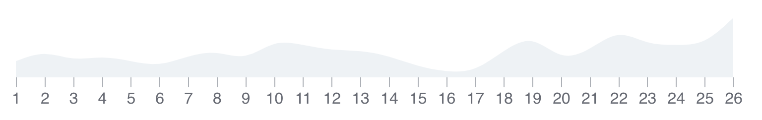
Now we are ready to configure and render our brush using the usual pattern:
chartBrush
    .width(containerWidth)
    .height(100)
    .xAxisFormat(chartBrush.axisTimeCombinations.DAY_MONTH)
    .margin({top:0, bottom: 40, left: 50, right: 30});

brushContainer.datum(brushData).call(chartBrush);
Notice that we are setting the x-axis format to a constant called DAY_MONTH within the axisTimeCombinations object. This xAxisFormat option is a way for us to select a date format that works for our data. In this case, it is the day of the month, as the default one (hours) was showing the same hour every day.
This code renders a simple Brush chart:
This chart only serves as an overview of the sum of data in our dataset. What we want to do is, when we drag and drop a section of the brush, select that portion of our dataset and re-render the line chart with it.
For that, we listen to the customBrushEnd event on the brush, that returns the period of the brush selection. We take the beginning and end of that period and filter our original data with them. Finally, we apply it to the line chart and re-render. Here is the code for it:
chartBrush
    .width(containerWidth)
    .height(100)
    .xAxisFormat(chartBrush.axisTimeCombinations.DAY_MONTH)
    .margin({ top: 0, bottom: 40, left: 50, right: 30 })
    .on('customBrushEnd', ([brushStart, brushEnd]) => {
        if (brushStart && brushEnd) {
            let filteredLineData = filterData(brushStart, brushEnd);

            container.datum(filteredLineData).call(lineChart);
        }
    });
This results in a data visualization where we can focus on different sections of the data, and use our tooltip to see the values on those:
Here is the filtering logic for your reference:
const isInRange = (startDate, endDate, {date}) => new Date(date) >= startDate && new Date(date) <= endDate;
const filterData = (brushStart, brushEnd) => {
    // Copy the data
    let data = JSON.parse(JSON.stringify(lineData));

    data.data = data.data.filter(isInRange.bind(null, brushStart, brushEnd));

    return data;
};
You can see the full code of this tutorial in this file and the tutorial working here.
Summary
In this tutorial, we have seen how we can use different support components like the legend and tooltip to provide information about our charts. We also saw how we could use the brush chart to provide a high-level view of our dataset. We saw how to configure the brush to filter the data and how to reload our main chart with this new data.
To learn more, you can read our Styling Britecharts tutorial or check our demos and documentation. If you decided to use Britecharts in your project, you could follow the Installing Britecharts tutorial to learn what's the better way to use Britecharts. Check also the Topics page to learn more about our approach.
If you are excited about Britecharts, want to add more configurable properties or even create your own chart, please check our [Contributing Guide][contribute]. In it, we walk you through the development environment setup, running our docs and demos and creating new Pull Requests.